December 12, 2008

More lil' Norse Gods

Yup yup. More sketches, from today, and the box design wrap-around illustration (above). Also, Huginnmuninngerifreki, and the color design images for Thor and Loki! Excitement! Pictures! Silly things! Cuteness! Yay!

Final Project for Concepts

Well, this is it; I'm done with Illustration Concepts. Oh, sure, I have a final one-on-one critique with my teacher, but as far as work for the class, I'm done. So, before I dive headlong back into my final for Character Development (I've got some more sketches and progress to post later), here it is--my final series for Concepts I. I chose to do sourcebook-style illustrations and layouts of some of the fae races from one of my writing-worlds. The races illustrated here are the Daoine Sidhe, the Lesidhe, and the Cu Sidhe.


December 5, 2008

Character Design final sketches

Oh god, finals time. So much work. But I really love my final projects, so it's all good! These are the design sketches for my final in Character Development, which is going to be the full drawings for a series of blind box vinyl toys based on Norse mythology. I'm only doing three finished designs, due to time constraints, maybe a fourth one next week, but I could see this as several sets of toys, which I may keep working on because I enjoy the challenge. These are meant to fit in a single uniform sized box, so that you can't tell what's what, even with shaking, and for homework this week I'll be illustrating that box as well as working on the final color designs for these guys in illustrator.

As an aside, I love the names of objects in Norse myths, they're CRAZY. And clearly, Odin's ravens and wolves should be combined into a single creature called Huginnmuninngerifreki. End of story.

December 3, 2008

Poster design--Tokyo

So, I've been lame about updating--sorry all! Busy busy busy. But I'm back from Thanksgiving now, and embarking on various final projects and papers, so I have a little time now to post at least this. I've done other stuff, but it's not all scanned, so it'll have to be posted later. Might also post a cool photo or two I took on the morbid beach up by my cousin's place in Door county, if they turned out as well as I hope.

This assignment was to design a poster to advertise a city picked by name-out-of-a-hat, and lucky me, I got Tokyo! I wanted to portray it as a bustling, kinda crazy, but really fun place, so I chose to use some designer vinyl toys and this funky cityscape treatment. Left to right the toys are Ciao Ciao, by Tokidoki, Skull-kun, by Bounty Hunter, a Tinpo by UNKL, Shacho, a Takashi Murakami character toy, and a Bearbrick, by Mediacom. I realize they're not all exclusively Japanese designers, but as always with art some thing have to be chosen for aesthetics. I'm very happy with the end product; the final print is 18"x24", all digital from start to finish.

November 15, 2008

La Lucha Roller!


Rollergirl poster, finished at last! Well, I mean, it was finished a few days ago, but I've been busy. As you may have noticed, I did change my idea from the original design, but I'm glad I did. She loves everybody.... You're next! (shameless theft from a Yellow Note album)

Most of this was done in Illustrator, but then I cheated and used photoshop to get the line details, shading on the pile, and shines. The print is 11x17"

November 11, 2008

More figure drawing

Just one--this week's drawing from class--but I think this is definitely the most detailed and complete one yet. With 5 minute breaks every twenty (for the models), this was done over the course of about 5 hours. Vine charcoal on German Etch heavy rag paper--this stuff is 75% cotton and a dream to work on! Great texture and color. I'll have to get more--I just wish it wasn't almost $5 a sheet. The angled crop was interesting to work with.

November 7, 2008

Vectory, vectory goodness

I have made it my personal goal to conquer Illustrator. I can do the fancy tricks with gradients and transparency; now, I'm trying to get together a coherent illustrative style with this program as my ally.

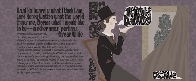
So, first, my Illustration Concepts book cover piece. I chose to re-do The Picture of Dorian Gray. The front cover and spine text is all hand-drawn, and the back is fonts. The gold leaf designs were free vectors from BenBlogged, but I did all the arrangement and patterning myself.

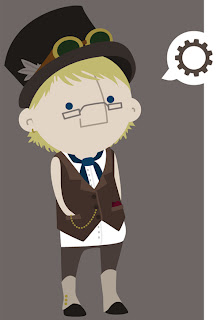
And then some fun for myself--I've been enjoying drawing little cute things like this, so I took my favorite one (a self portrait in my steampunk costume) in to play with more vectors.

October 30, 2008

More Roller Girl

This is the finished design for the rollergirl character from those sketches--next week, we're doing a poster with our characters, and I'm really excited about it. I think that a spiked hula hoop would be one of the most terrifying things in the world to encounter at high speeds while wearing roller skates.

Forgot about that poster....


Sorry guys, I totally forgot to show my final for the Halloween Poster project. So here it is; didn't win, as you can see by the posters that are actually posted, but I'm pretty happy with it.


Also, this week's in-class assignment for the same class; we had until 10:00 to do a complete, full-color, 4x4" illustration to accompany an article about the impracticality and awkwardness of the late-twenties-early-thirties "Birthday Dinner." This was mine.

October 24, 2008

Roller Derby! Go go go!

Sketches! Lots of sketches! Sketches of a rollergirl! Awesome!
Very fun class today. Because having someone skate around your classroom and tell you about the type of rugburn you get while wearing fishnets is just plain cool.
So, have some (fairly quick) drawings.


October 23, 2008

I draw for myself too, you know

I haven't taken pictures of my new Concepts piece, but I promise it'll be awesome when I do! So, to make up for lack of class work here, here's some stuff I colored just for my own amusement. Also, tattoo designs for my imaginary characters' imaginary skins.

October 13, 2008

One more figure....


Just one drawing tonight, but I'm really pleased with how it came out. The usual, charcoal, 18x24", etc. The tattoo was cool. (and since I was asked, it's mostly sketching-hardness, pure willow, vine charcoal, with compressed sticks for the darkest blacks)

October 7, 2008

Figure drawing fun!

So, I probably won't be posting much from this class. But here's a little sample of the work I've done so far in the Life Drawing class I'm auditing this semester. Since it's an audit, I only have drawings from in class, and since it's life drawing they're all 18x24" and way too big to scan. Hence the bad images. Oh well. I like how this class is going, the experience is really helpful.

October 4, 2008

Astronauts! Dinosaurs! Teenage tigers!

More character development--the finished piece from those sketches! The assignment was 10 or more characters interacting, and some of the work we were shown for inspiration were some of Dan Witz's mosh pit paintings. They really struck me, and though of course my piece isn't nearly that epic I did like the idea of filling the entire page with nothing but figures. From this rose forth..... The Truth About Extinction. The left is the hand drawn piece I presented in class, and the right is an edited version I'll be printing out as well.


And then another in class assignment, though not one I liked as well as previous ones; design the hip sales icon niece or nephew of a well-known advertising character. We could choose from the Jolly Green Giant, Smokey the Bear, or Tony the Tiger. I invented Tommy the Tiger, who is what 13 and 14 year olds want older teenagers to be like.
Sketches I promised, so sketches it is! Some of these are for projects, some are just from my sketchbook and my own amusement.

These are the character design sketches for a Character Development piece (which I'll be posting in a few minutes). Dinos versus astronauts, GO!


Just from my sketchbook--my character Romney, as an angel. He has little tiny nightingale wings. I'm working on coloring this one, just for fun.


The sketch for the next Concepts piece I'm doing--my class is working on designs for this year's halloween part posters! The theme will be circus/ funhouse/ freakshow. This is why I shouldn't be allowed to sketch in the middle of the night. Bad color is from lazy scanning and really light pencils.


And last but certainly not least, this is the half-color-mockup'd compilation of the sketches for a big piece I'm working on for my own amusement--a group of chracter portraits for Meg and my steampunk world! I'm going to do them all in watercolor, and the figures are about 8" tall, with relative heights and builds taken into consideration.
Left to right: Adrienne, Al, Romney, Kyu, Cain, Rufus, and Captain Riverhawk. Jager to be added.

September 28, 2008

And now, I design characters. Primarily out of squares.

In contrast to my one finished Illustration Concepts piece, I've done an overwhelming amount of work for my other studio class--Character Development. Each week we've had one homework assignment and then another assignment completed during the last two hours of class. It's frantic but fun, and I think I've gotten some really good pieces out of the process ^^ So, here's everything so far for that class! The originals are all about 9"x12" without their borders.

The first assignment was a character playing a musical instrument, with exaggerated and expressive body language. Naturally, I picked marching band, because there's always that one trumpet freshman you just want to smack.....


In class that week: randomly selected adjective, shape, and job. Mine? Excited, square, pilot. Got weirdly cut off during scanning, I'll get a better scan for the website later.

Next, The Only Survivor. Exactly what it sounds like. Any scenario; we had a lot of battles in the class's work, but also a lot of eating contests. I went for the rather disgruntled last unicorn, myself.
Then in class, The Odd Couple. Not necessarily a couple, but a pair of characters in one piece with contrasting body types/shapes/language. The jersey is the proper OSU jersey :P
After that, Team Up. 3-5 varied characters working together to fulfill a goal. This one is a work in progress again after I royally screwed it up by trying to add grass in ink.... I cut out the figures (the good part) and will be using them to complete the assignment in a different way; in the background there's plains and rolling mountains.... and a giant wooly mammoth foot. The source of terror. Down in front, the other object of attention; rabbit tracks. I'll post this again when it's properly finished, I hope.
Then in class this week, a transformation in 3-5 steps. A lot of people did cute-things-into-monsters, but I was getting sick of my square people and did this wiggly 1920s flapper turning into a bird instead, for a change of pace. The color was added later.
So, that's what I know about that.
Next up: Sketches. Because there's a lot of them.